I'm with Stephanie! i actually like the first a bit better--except it is a little busier and I can't quite tell what everything is--does it say Proof? Is that what's on the heads? Ithink the menacing eyes are cool. But, I also like the little blue banner on the second one that says, "Battle for Wizard Island".
Agree with Braden. The second is a bit better, no so busy. At the same time both are awesome. Best luck, Anna del C. Dye Author of "The Silent Warrior Trilogy" http://www.annadelc.com
I like them both. I love the colors. So eye-catching. I like the one with the banner a little more. I am partial to banners. I think they pull the eye to the cover.
I like the colors of the second one better but the first one has more menace to it. I also like the 'Crater Lake' 3D effect on the second one. If the 'Crater Lake' and lighter coloring were on the first one, I'd like that one better.
Aaron says that since its Battle for wizard Island the first one looks more wizardly (word??) Ryan likes the first one also he says it looks more like a fantasy book which are his favorite kind. I like the 2nd one cuz the sub title pops out more. But when the boys explain their ideas I think HUMMM I can see their point.
I like the second one better. The colors are easier to look at. The letters seem a little sharper and I think the background fits in better with the title. Can't wait til it comes out. It looks very interesting.
I like the second one. It looks like there is some sort of writing or shapes on the heads in the first one that could be distracting. I think the second one is easier on the eyes and the colors look great!
Cover #1 - I like this background best - the spooky castle and eyes coming out of the mist. It is a bit busy and I'm not sure exactly what it's supposed to portray. Maybe too many of the plot elements? I like the people images on this one best - but hate (yes, hate) the white funky stuff on them. The one straight line that goes diagonal from the left guy - I thought it represented a gun and had to enlarge the picture to get a good look at it.
Cover #2 - I like the banner with the subtitle better done this way. The guy with that hat on the right makes me think of a western miner or cowboy type.
I would combine the elements I like of each into one cover. But if you had to choose one vs another . . . I would choose cover #2 because, like I said, I really hate that white stuff on the people in cover #1. If the white stuff was gone, I'd go for cover #1.
I would pick up #2 because it is less busy and I can see that it resembles the Crater Lake I know. Though #1 tells you there is a lot of adventure ahead. I vote #2.
I like the one with the banner better, not because of the banner, but because there is less going on, and Crater Lake is in the background. In the other one, there is no real clear point, no story being told on the cover. I have no idea what the story line in the book is, but, just based on those two covers, I'd be more likely to read the bannered one. My two cents worth!
Love the 2nd cover. They are both great, but the "Battle for Wizard Island" is much clearer. Wow! CFI does such a great job on their covers. I'm excited for you!
I don't know why this will only let me post a comment under anonymous, but here you go.
Thanks for the thoughts and opinions. Like many of you, I like elements of both and I'm hoping we can merge the best of both covers. FYI- the white stuff around the heads is not permanent. It is the word PROOF because it is a draft version of the cover. Have no fear, it will be gone. It seems like the biggest complaint on the first is that it seems too busy--too many elements at work while the second is clear and simple. This is for a mid-grade fantasy audience so I really like the spookiness of the first. Your comments will help to make some good changes. Thanks.
Definitely the second one. The first one is kinda creepy with the white glowing parts of the black bodies. I think the second is cleaner and easier on the eyes.
oh just read your proof explanation. Funny. I was wondering why in the world they did that to the people's heads. I do like the banner and I like the title better in the 2nd one also.
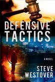
Welcome to the Westover Writes blog. In addition to some basic information about me, you will also find various writings and musings about things that interest me... my new book, Defensive Tactics, that will be in stores August of 2010, book reviews, gospel subjects, interesting experiences, Missouri LDS Church History sites, etc.
I hope you enjoy your time on the blog and return often to see what I may be rambling about.
My wife and I have lived in small town, rural Missouri for 12 years and have 4 entertaining and wonderful children. I never expected to be living on a farm with chickens, cows, kittens and a dog. The kids love 'em.
My life revolves around spending time with my family. Being a father and a husband are the most important things I can concentrate my time on and I enjoy it.
I published my first novel, DEFENSIVE TACTICS, in August 2010.
My second novel, Crater Lake: Battle for Wizard Island is under contract with Cedar Fort Publishing and should be released in the Spring of 2012.
The temple lot in Independence, Missouri, which was dedicated by the Prophet Joseph Smith on 3 August 1831, and surrounding area. Portions of the temple lot are now owned by the Church and by two other faiths. (1) Latter-day Saint visitors’ center; (2) Independence Missouri Stake Center; (3) Missouri Independence Mission office; (4) site of 1833 Church printing office; (5) the spot where the Prophet stood to dedicate the temple lot, now owned by the Church of Christ (Temple Lot); (6) auditorium of the Community of Christ, formerly known as the Reorganized Church; (7) Community of Christ Temple, a house of public worship.


Well, I'm no help whatsoever because I think they're both awesome!
ReplyDeleteI'm with Stephanie! i actually like the first a bit better--except it is a little busier and I can't quite tell what everything is--does it say Proof? Is that what's on the heads? Ithink the menacing eyes are cool. But, I also like the little blue banner on the second one that says, "Battle for Wizard Island".
ReplyDeleteCool, either way! How exciting.
Agree with Braden. The second is a bit better, no so busy. At the same time both are awesome. Best luck,
ReplyDeleteAnna del C. Dye
Author of "The Silent Warrior Trilogy"
http://www.annadelc.com
I like them both. I love the colors. So eye-catching. I like the one with the banner a little more. I am partial to banners. I think they pull the eye to the cover.
ReplyDeleteI like the colors of the second one better but the first one has more menace to it. I also like the 'Crater Lake' 3D effect on the second one. If the 'Crater Lake' and lighter coloring were on the first one, I'd like that one better.
ReplyDeleteI'm going with the top one. The characters look more mysterious. I like the background and color scheme better. The little menacing eyes are cool.
ReplyDeleteI like the first one better. I think it catches the eye better and is a bit more eerie! I like eerie and suspenseful.
ReplyDeleteAaron says that since its Battle for wizard Island the first one looks more wizardly (word??) Ryan likes the first one also he says it looks more like a fantasy book which are his favorite kind. I like the 2nd one cuz the sub title pops out more. But when the boys explain their ideas I think HUMMM I can see their point.
ReplyDeleteI like the second one better. The colors are easier to look at. The letters seem a little sharper and I think the background fits in better with the title. Can't wait til it comes out. It looks very interesting.
ReplyDeleteI like the second one. It looks like there is some sort of writing or shapes on the heads in the first one that could be distracting. I think the second one is easier on the eyes and the colors look great!
ReplyDeleteThey are both pretty awesome, but I like the second one better:-)
ReplyDeleteI have pretty mixed opinions.
ReplyDeleteCover #1 - I like this background best - the spooky castle and eyes coming out of the mist. It is a bit busy and I'm not sure exactly what it's supposed to portray. Maybe too many of the plot elements? I like the people images on this one best - but hate (yes, hate) the white funky stuff on them. The one straight line that goes diagonal from the left guy - I thought it represented a gun and had to enlarge the picture to get a good look at it.
Cover #2 - I like the banner with the subtitle better done this way. The guy with that hat on the right makes me think of a western miner or cowboy type.
I would combine the elements I like of each into one cover. But if you had to choose one vs another . . . I would choose cover #2 because, like I said, I really hate that white stuff on the people in cover #1. If the white stuff was gone, I'd go for cover #1.
Good luck! Can't wait to see which one wins! =)
I would pick up #2 because it is less busy and I can see that it resembles the Crater Lake I know. Though #1 tells you there is a lot of adventure ahead. I vote #2.
ReplyDeleteI like the one with the banner better, not because of the banner, but because there is less going on, and Crater Lake is in the background. In the other one, there is no real clear point, no story being told on the cover. I have no idea what the story line in the book is, but, just based on those two covers, I'd be more likely to read the bannered one.
ReplyDeleteMy two cents worth!
Love the 2nd cover. They are both great, but the "Battle for Wizard Island" is much clearer. Wow! CFI does such a great job on their covers. I'm excited for you!
ReplyDeleteI think I'd have to choose the 2nd cover.
ReplyDeleteI don't know why this will only let me post a comment under anonymous, but here you go.
ReplyDeleteThanks for the thoughts and opinions. Like many of you, I like elements of both and I'm hoping we can merge the best of both covers.
FYI- the white stuff around the heads is not permanent. It is the word PROOF because it is a draft version of the cover. Have no fear, it will be gone.
It seems like the biggest complaint on the first is that it seems too busy--too many elements at work while the second is clear and simple. This is for a mid-grade fantasy audience so I really like the spookiness of the first. Your comments will help to make some good changes. Thanks.
Definitely the second one. The first one is kinda creepy with the white glowing parts of the black bodies. I think the second is cleaner and easier on the eyes.
ReplyDeleteoh just read your proof explanation. Funny. I was wondering why in the world they did that to the people's heads. I do like the banner and I like the title better in the 2nd one also.
ReplyDelete